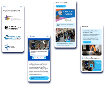
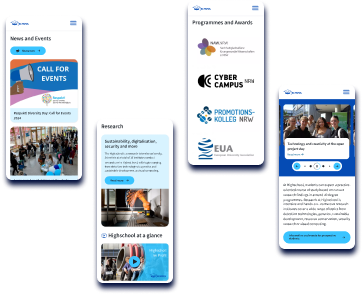
University of Applied sciences’ new website
Migration from Drupal 7: simplified content management and enhanced user experience with innovative modules and integrations.
Key takeaways
We migrated the multilingual website of the University of Applied Science from Drupal 7 to Drupal 9.
The website served thousands of users, had contributions from hundreds of authors, and included an intranet. However, it also had an outdated access management system and lacked a user- and mobile-friendly design and interface, which was dealt with by our team as part of the project.
Features
- A modern, mobile-friendly, intuitive, cohesive, and scalable design and interface.
- Optimal appearance across all devices.
- An enhanced, user-friendly multilevel access management system.
- A streamlined content approval and publishing system.
- Integrations with DIAS, BITE, Opus 4, and an embedded podcast player.
Existing ecosystem
The university has over 9,500 students, employing more than 800 staff, including 150 professors, across 40+ departments.
Its website serves two primary functions:
- As a hub for scientific and marketing content, including a database of research projects, news, articles, scientific publications, videos, and podcasts.
- As an internal workspace (intranet) for editors and administrators, containing non-public content, such as internal news, events, articles, and so forth.
120GB
Related images and documents
15
Editable page types available to managers
40
Various customizable block types
15k
Content pages with rich media
Content-making process
The content-making process is intricate and involves a wide set of nuances related to the way the university operates:
The website was built on Drupal 7, around 10 years before the project. As a result, its interface and access management were quite complicated and weren't very user-friendly or mobile-friendly.
There have been complaints from administrators and editors. Images prepared by hundreds of content-makers could have a small size and low resolution. Besides, there was only one size of an image for all devices; so they could appear as bad quality on some devices. For the marketing team, the image quality control process was strenuous.
Furthermore, the website design did not follow modern trends, making it appear obsolete. All of this could affect the university’s perception, potentially making it less attractive to prospective students.

Volha Tsiamliak
Team Lead
Challenges
Migrating to a newer Drupal version, whilst gaining access to the latest tech and modules was only part of the success equation.
Migration
01
Migrate the website from Drupal 7 to a newer version, gaining access to the latest advanced technologies and modules.
Create a new website design that looks modern, renders well on all devices, and employs contemporary technology to enhance user experience.
Migrate 15,000+ pages along with their related images and documents to the new improved structure.
Complete additional tasks, including required integrations.
Content management
02
Enhance the multilevel access management system to allow the editorial team to control publications produced by various departments, institutes, and faculties, while ensuring simplicity and convenience for all roles involved in the content-making process.
Provide authors and editors with a new user-friendly publishing admin panel that makes the content publishing process extremely simple and intuitive.
Develop a solution for automated processing of images uploaded by hundreds of authors, ensuring they look good on any device.
Solutions
To help the University achieve its goals, our team identified a set of optimal solutions while migrating the website to Drupal 9.
In particular, we employed a range of Drupal modules to make the new website user-friendly and easily scalable while reducing costs, simplify access management, and ensure cohesiveness:
These modules provided a variety of functionalities, such as adding moderation states for content, establishing workflows with transitions between different states, defining permissions for individual menus, enabling group functionality for the Node module, allowing automatic publishing and unpublishing of content, and creating a reusable and structured library of images.
We were strict about security — the site should not be vulnerable to any attacks. Thus, we used the best modules and followed best practices to prevent damage.
Site features
Before the website migration, the University utilized a taxonomy-based system to manage access permissions.
Only developers could implement most changes, such as adding a new department into the system. And it was impossible to create a department's page. To improve the access management system more quickly and reduce development and support costs, we implemented a ready-made contributed Drupal module "Group".
The Group module was designed with the goal of making access management as user-friendly as possible. With this module, the University could configure scenarios for access permissions directly through the admin panel, without any custom code. Each of the over 50 different departments received its own page. Employees and students engaged in content creation gained tailored access to editing and adding content. Within each department, a hierarchy of roles like "Assistant," "Editor," and "Administrator" was established, each with specific permissions. Implementation of the Group module dramatically simplified the process of controlling publications across the University’s departments.
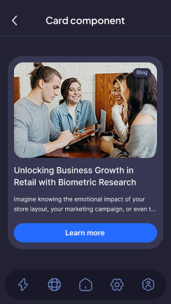
Storybook and Theme Processor helped us significantly simplify the development and integration of the frontend for Drupal: reduce development costs, ensure cohesive design, and make the website easily scalable.
We used Storybook as a development environment for the frontend. This allowed us to develop and test UI components in isolation from the site’s business logic. These components were then combined into larger elements and the site pages.
The Theme Processor acted as a unique bridge between development units, allowing developers to easily specify which Storybook components or elements they needed in a particular spot on the website, and then pass the related data to the frontend.
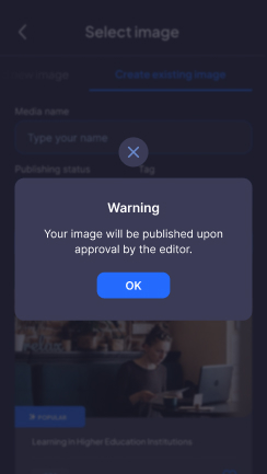
This feature helped reduce development time by at least 20 hours when automating the processing of the numerous images uploaded directly by users to the site.
Why automated image processing was required:
Modern image display standards dictate providing tailored image sizes for each device screen size. The University had hundreds of content creators, and they often included images in their content. The goal was to ensure that users only needed to upload images in their original size. After publishing, the CMS should automatically adjust these image parameters to be optimal for a specific device. This feature was particularly vital given the increasing use of mobile devices to access the site, where internet connections can occasionally be unstable.
The Drupal Image Styles tool enables us to scale, crop, resize, rotate, desaturate images, and convert their types; due to that, images look good on various devices, including Retina displays of Macs, tablets, and small cell phone screens. However, the challenge is that a developer typically has to manually set the necessary image parameters for each unique block on the website.
To eliminate manual operations, we developed a smart tool that automatically performs the required actions based on the parameters provided. This ensured that the correct image size was automatically delivered for each block on various devices.
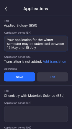
At the University, different educational programs have individual application deadlines. Editors are responsible for updating these deadlines.
Before the website migration, this was a challenging process: editors had to modify application dates on separate pages for each program. We developed a dedicated page for editors, allowing them to modify or delete the 'Application Period' field value for Degree Programs in a single place.
Specifically, we created a unique Content Type for both languages. With the new page, editors could adjust the 'Application Period' field values quickly, as they didn't have to open an individual editing page for each program anymore. Given the number of departments and nodes on the site, this functionality is crucial.
Integrations
We implemented several integrations for the new University website, including:
- Podcast Player. We integrated a personalized podcast player via an iframe. Users can input a link to the podcast or playlist, and the item is embedded into the page through the iframe and cached to speed up output.
- Lists of Publications — University Library Service. Publications are accumulated on the publications server and automatically listed on the website.
- Vacancies are displayed on the site via the BITE API. To respond to or interact with these vacancies, users are directed to the BITE system.
- Official announcements and university rules are stored on a third-party platform, DIAS. On the Drupal side, pages containing these publications are stored as separate entities. This allows them to be cached and displayed even if the DIAS platform becomes unavailable.
Results
"We appreciate their expertise and hard work and look forward to working with Attico International’s team.
The website of our university is an essential part of our communication and outreach efforts. We needed a reliable partner to help us improve our Drupal backend functionality, and Attico International delivered. The new features and integrations they implemented have made our website more efficient, user-friendly, and streamlined. We appreciate their expertise and hard work and look forward to working with Attico International’s team."
Client's representative
This case study was covered on a popular resource The Drop Times
Let’s talk!
Whether you have a small urgent task, or a large ambitious project, we can help
