as Freedom for Frontend and Backend Drupal Development
Insight for: Developers

A design system is a valuable tool for reducing frontend development costs in larger projects where multiple teams work on different apps within the same brand. In such projects, it is essential to have a well-defined design system to maintain consistency and reduce the development time and cost
In complex organizations, such as universities or corporations with multiple subsidiaries or brands, it is often necessary to have a large number of websites and/or mobile applications that are visually consistent with the organization but also distinctive.
For such types of projects, it is better to have a tool that maintains consistency while allowing for distinct visual designs, reducing maintenance effort, and scaling quickly and affordably. In addition, teams may have different processes, tools, and design standards, which can lead to a lack of consistency across the organization.
In modern UI design, hundreds of modular components are used to create different user experiences. A design system streamlines this process by consolidating these common UI components into a centralized, well-maintained repository, which is then distributed via a package manager. This means that developers can import standardized UI components, rather than duplicating code across multiple projects.
The design system is a collaborative effort between designers, frontend and back-end developers, serving as a bridge between these teams. This allows for easy reuse of design system components across projects, while still enabling further customization if necessary.
The Design System is structured into different levels, including atoms, molecules, organisms, and pages. Each component can be customized with different variations, allowing for flexibility in design.
Using an atomic approach, the Design System allows for developers to make changes that will affect all pages, modules, or paragraphs. Additionally, the system enables the easy addition of new websites that can initially be based on a basic master theme, but then have their own unique fonts, colors, and variants.
We used this approach when working with our partner Taikonauten digital agency for the development of the websites for The Hochschule Bonn-Rhein-Sieg, University of Applied Sciences (H-BRS) and a Large Chemical Producer.

Emulsify is a versatile tool that serves as a bridge between Drupal and Storybook, allowing for the use of twig in components. It not only acts as a Drupal theme but also doubles as a standalone prototyping tool with twig templates or integrated into a Drupal installation.
Emulsify promotes modularity in component building, which allows the reuse of components across projects. The components built for one project can be utilized in others without compromising code quality. Emulsify ensures consistency across multiple projects by maintaining the same data structure and basic theme configuration.
Emulsify enables parallel frontend and backend development, as well as content modeling. This approach allows developers to work on different parts of the project simultaneously, reducing development time and increasing efficiency.
Emulsify is an open-source project that's free for everyone.
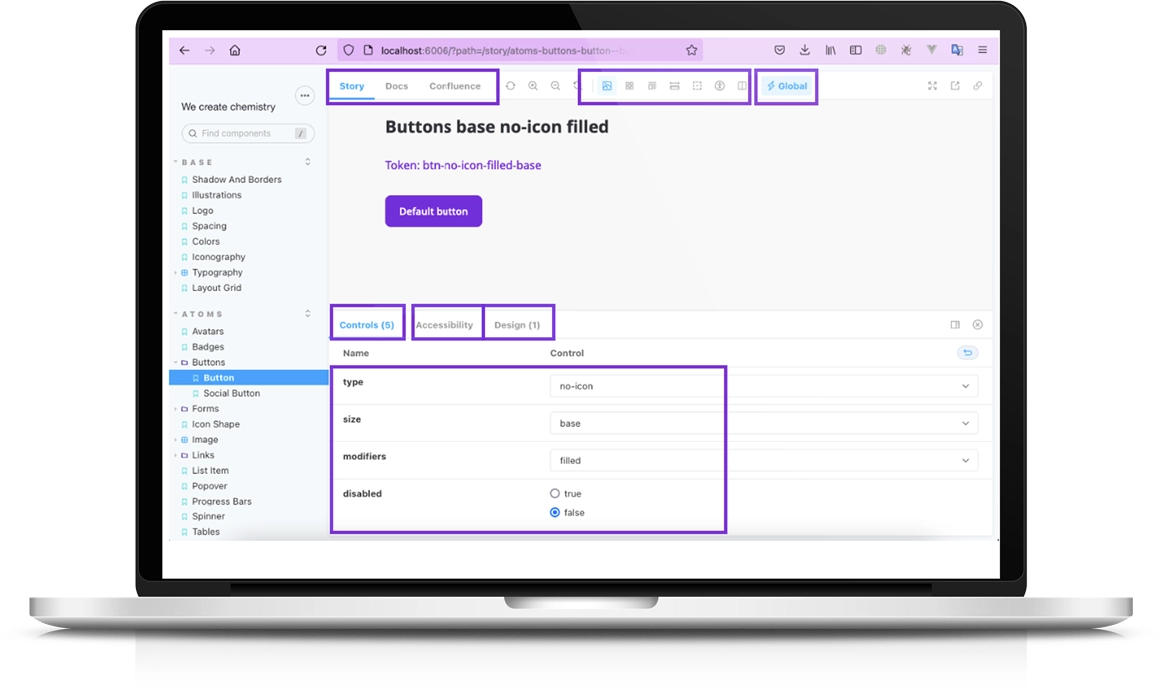
Storybook is an open-source tool for building UI components and pages in isolation. It streamlines UI development, testing, and documentation. This allows you to work on one component at a time. You can develop entire UIs without needing to start up a complex dev stack, force certain data into your database, or navigate around your application.
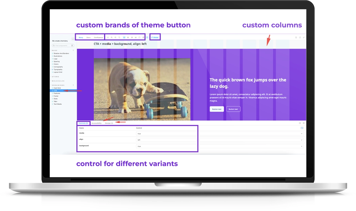
Storybook can be easily customized to suit the specific needs of your project, including custom breakpoints, grids, and themes, as well as the ability to measure element paddings and borders. With the ability to add custom tabs, users can enhance the functionality of their Storybook, adding additional features and functionality such as brand or theme buttons.
Storybook can also allow users to store documentation on how components can be used, how the grid system should behave, and more. We can export pages from Confluence as markdown files and import them directly into Storybook, making it easy to manage and maintain documentation.
We can test how elements will behave in different scenarios, including clicking, active states, and modals. Controls help us to show different elements variations with the same templates.
We can integrate a design preview for each component to make it clear how the element looked in the original design.
Storybook has a rich ecosystem of addons, one of which gives us accessibility/visual regression testing and feedback tools right in the UI while developing.
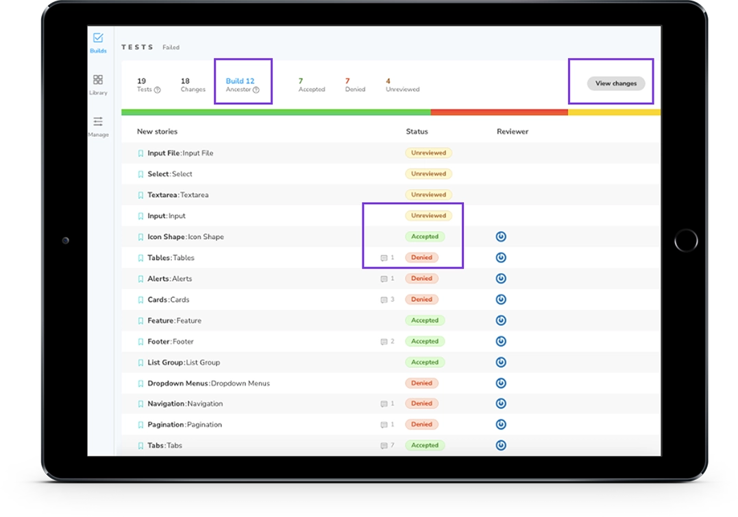
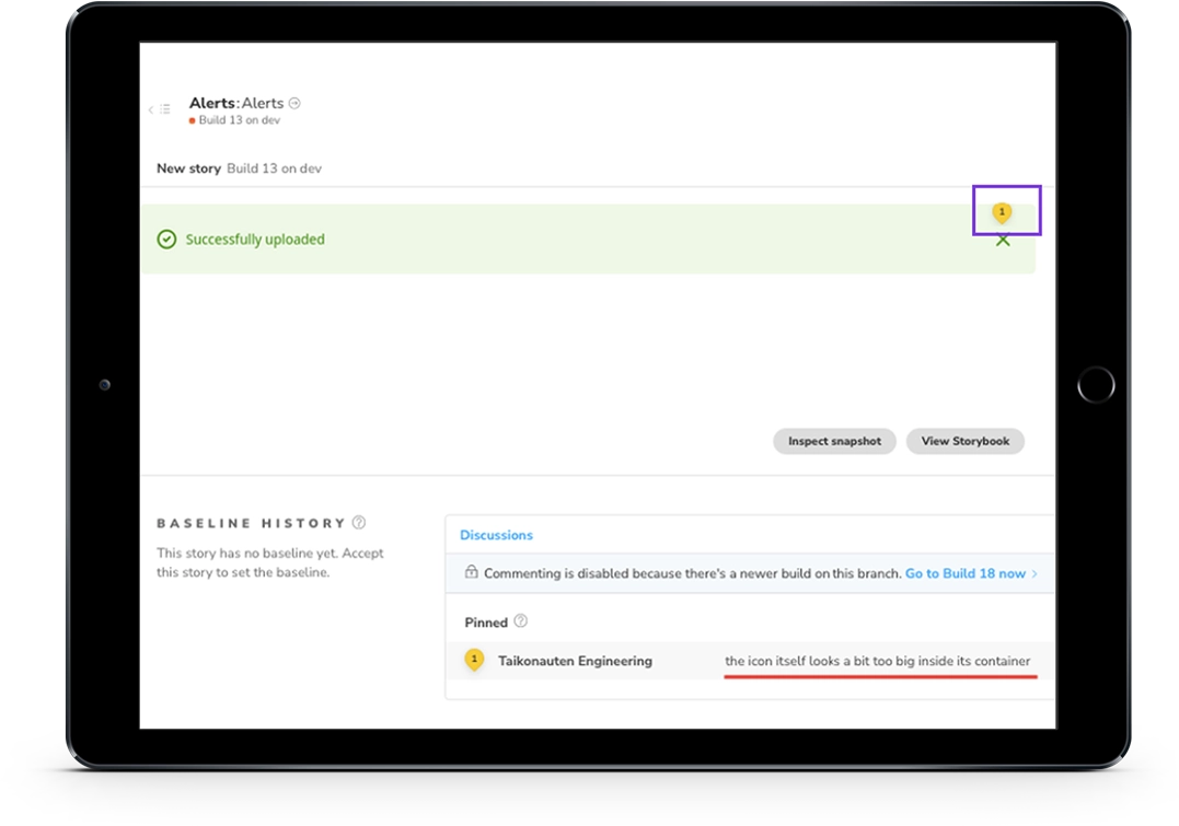
Chromatic provides free hosting for both private and public Storybook projects. You can publish it and collaborate with your team to review and test them. Chromatic made it possible to include designers in the review process during component development.
With Chromatic, you are able to create different builds, comment on components, assign reviewers, compare screenshots, and manage different branches and builds. Typically, all design checks are done on Chromatic, where designers add comments, and developers respond to them and can approve or reject components.
Additionally, Chromatic allows for the use of custom domains, although this feature requires payment.
A design system's central part is a component library, which includes reusable components of different sizes, such as buttons, links, carousels, or text+media blocks.
Emulsify, a Drupal theme, integrates Storybook with Drupal and allows using Twig templates in Storybook components. The frontend team designs Twig templates, component styles, and writes React-based component stories for Storybook. React is also used to customize Storybook.
On the other hand, the backend team works with Drupal modules, creates paragraphs and fields, preprocesses data, and includes Twig templates with an exact path.
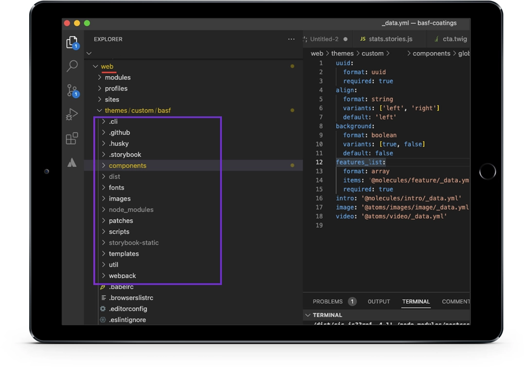
If we have multiple site structures, such as different brands, we can use a general theme on Drupal and divide it into different themes inside Storybook to have one Storybook for all brands.
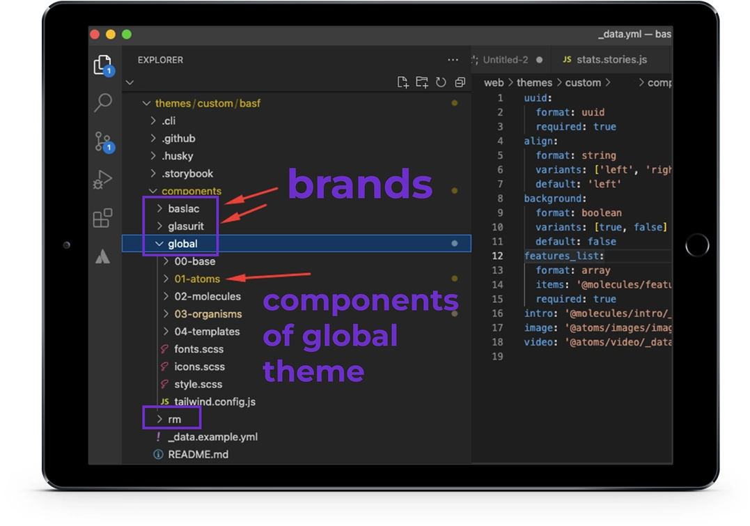
The components are entirely modular, and Storybook's entire instance can be duplicated on another Drupal site with Emulsify, although you need to modify styles and data structure for project needs.
The component-based design aligns with atomic design methodology. This methodology breaks down elements into five categories: Atoms, Molecules, Organisms, Templates, and Pages. Atoms are the smallest parts of a website, while molecules build on atoms, organisms on molecules, and so on.
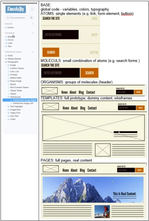
Component structure:
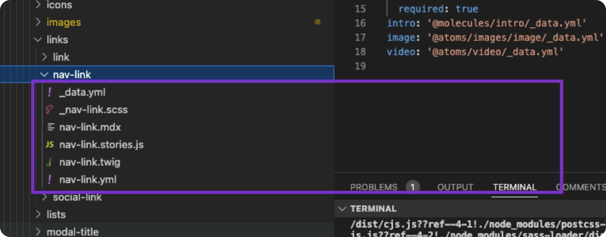
Each component includes:
Are you considering adopting a design system? Here are some situations where the Emulsify approach could be a good fit:
However, if you only have three templates with simple elements, the standard Drupal theming approach may suffice. Emulsify offers frontend developers the ability to start building pieces of a project before the back-end team has set up the Drupal site, making it an increasingly popular option. By adopting a component-based approach, frontend developers can work more efficiently and effectively, resulting in greater consistency, flexibility, reusability and velocity for development overall.