
Design glossary: speak like a designer, not a confuser
This design glossary offers clear UI/UX terminology and definitions to help designers and non-designers speak the same language.
Learn how Figma variables sync with Drupal using automated tokens, multibrand setups, and smooth workflows that keep design and code always aligned.

Keeping design and code in sync is one of the biggest challenges in modern digital projects.
Usually, Figma designs become outdated within a month after a project’s release. While code evolves, design often lags behind. For a business, maintaining alignment between both worlds is crucial for consistency and efficiency.
To solve this, we built an automated workflow between Figma and Drupal, powered by design system tokens that are exported from Figma to Drupal. Design tokens are the most important part of a multi-brand design system. They are all the values needed to construct and maintain a design system — spacing, color, typography, object styles, animation — represented as data. These can include anything defined by design, such as a color in HEX format, an opacity as a decimal value, or an animation using an ease function.
This setup allows designers to make updates once in Figma and see those changes automatically applied across all Drupal themes — saving time, reducing manual effort, and minimizing human error.

In general, all processes can be effectively analyzed and documented within a DesignOps framework.
We implemented Figma Variables for each component, enabling efficient design system tokenization and grouping them into structured collections.
Includes fixed raw values such as grid, spacing, colors, typography, and stroke.
If the project is large and involves multiple designers, this collection can be separated into its own Figma Library to ensure consistency and prevent accidental changes.
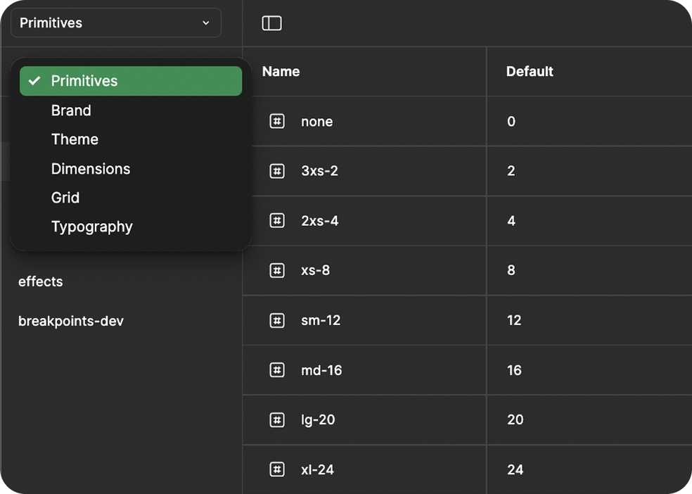
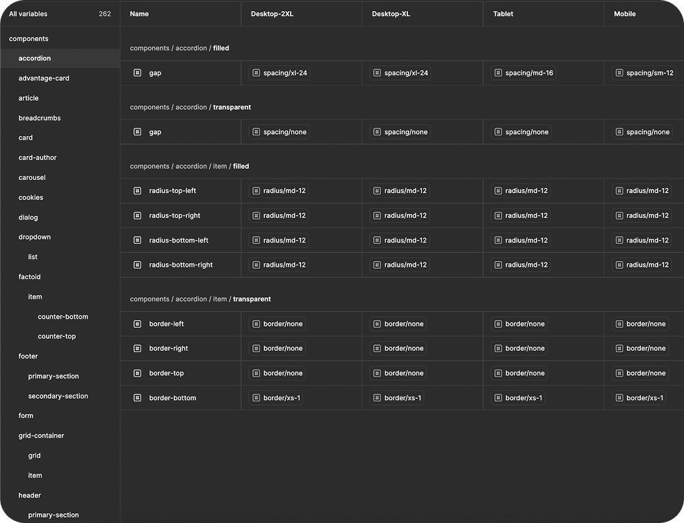
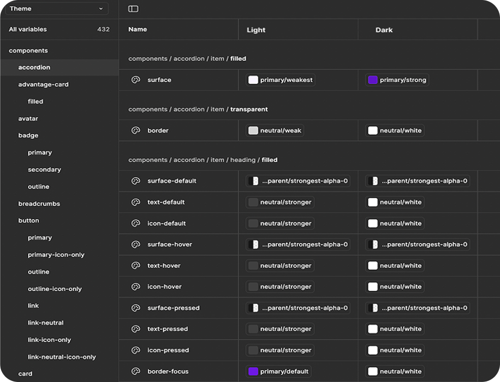
All component-level variables are linked to the Primitives and Colors collections, ensuring a single source of truth across the design system.
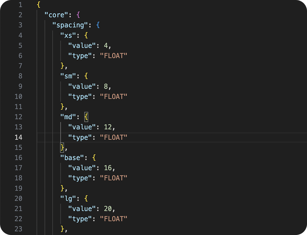
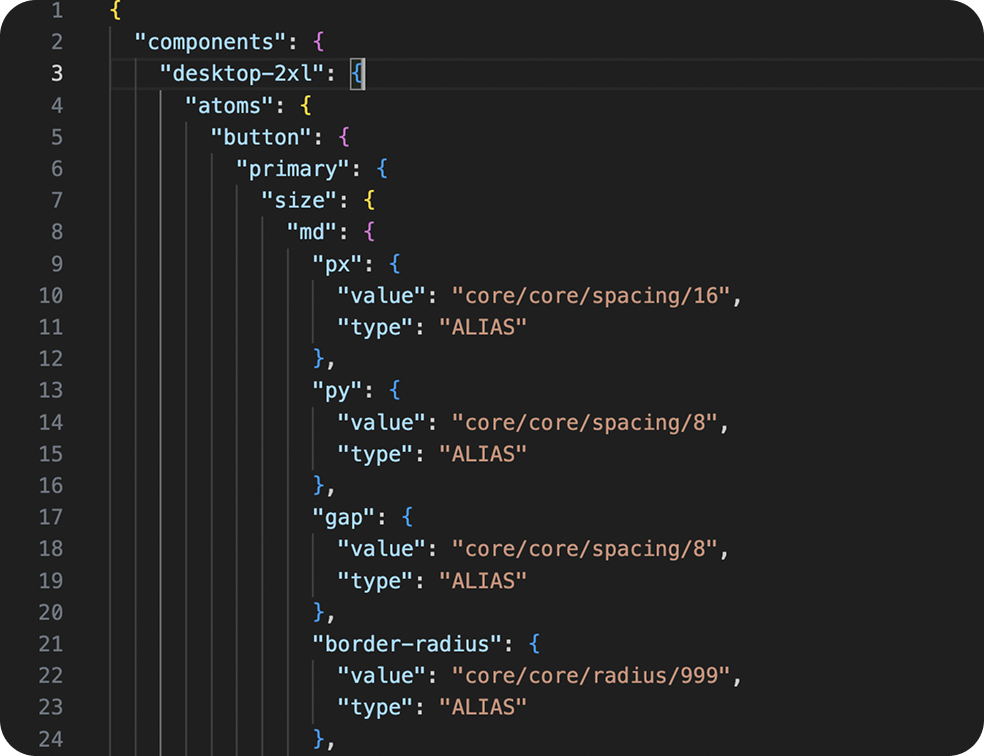
We developed a Figma Token Export Plugin that exports design system tokens (variable collections) into structured JSON files. However, any free plugin from the Figma Community can work as well.
Each collection generates a dedicated export file. For example:
Inside the exported JSONs, each token is represented as a structured object containing collections, value types, and aliases.
As of December 2025, Figma introduced a native feature that allows importing design tokens directly into Figma Design. To do that, design tokens must be in a JSON file and follow the DTCG format. Figma also supports exporting variables back into a JSON file, making it easier to maintain a two-way workflow between design and development.

There are two main approaches to organizing a multibrand scalable design system: one Figma file with multiple modes and multiple Figma files with a Core Design System.
Each brand is represented as a mode, and the entire system lives in a single Figma file. This approach has its pros and cons.
Pros:
Cons:
Each brand has its own Figma file, linked to a Core Design System library.
Every file exports its own JSON file with Figma tokens.
The Core Design System file contains:
In this setup, each Drupal theme has its own JSON file acting as an override layer:
This structure keeps brand-specific customization clean and maintainable.
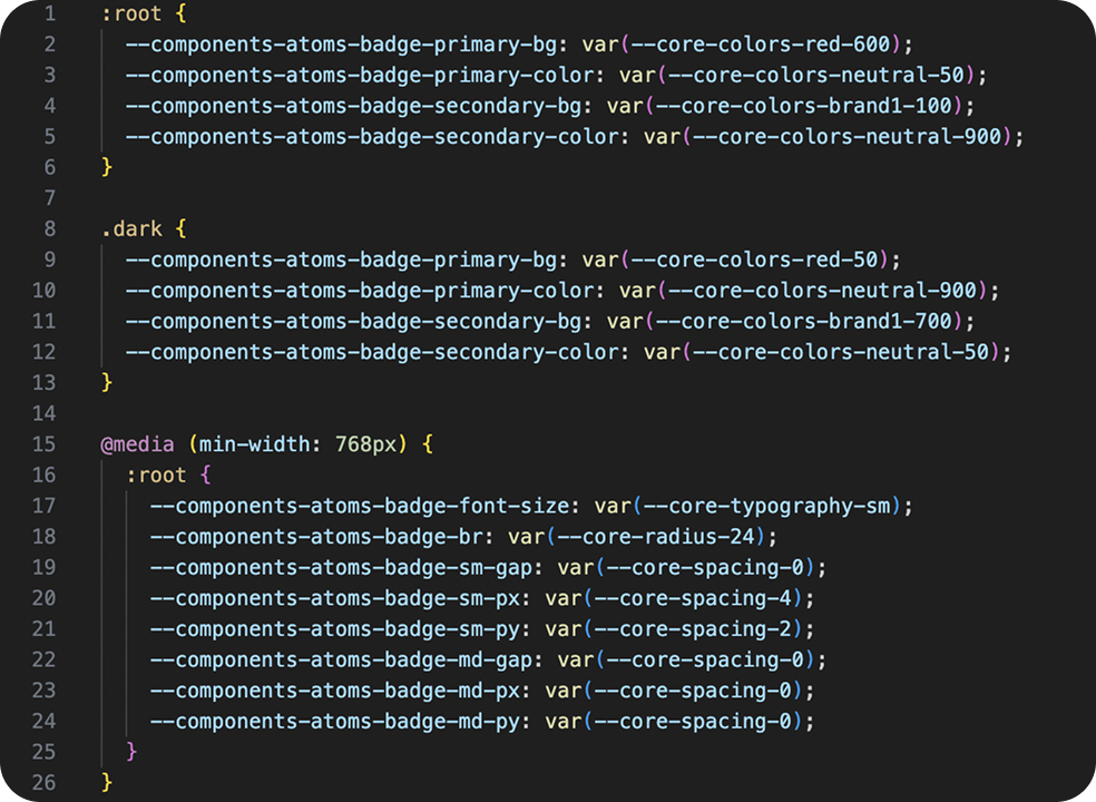
To automate token generation, we use a custom Node.js script. It takes exported Figma JSON tokens and converts them into CSS variables for each theme and component.
The script reads all token files from the /tokens directory of each theme, processes them, and outputs generated .scss files with correctly formatted variables, responsive breakpoints, and light/dark mode selectors.
Here’s what it does step by step:
Generates CSS variables
Recursively processes each JSON object to produce valid CSS variable declarations:
--components-button-primary-bg: var(--core-colors-red-600);
Wraps variables with proper selectors such as :root, .dark, or @media queries for responsive values:
:root {
--color-text: #111;
}
@media (min-width: 768px) {
:root {
--core-spacing-md: 1rem;
}
}
All SCSS files are compiled into a git-ignored directory containing the generated CSS variables. Each component gets its own file, which includes responsive breakpoints and light/dark mode variables.
Collections such as Typography and Core are built as separate SCSS files, one per collection.

Example of auto-generated badge-vars.scss
All these files are imported automatically during the webpack build. We only need a single import inside the Global Design System — no manual setup per theme.
We also added a frontend variable layer with simplified variable names. This allows us to override variables in any component and control them directly in code.
If a Figma variable name changes (rare but possible), we only need to update it once, where the default value is defined.
We recommend defining variables at the root level, which allows them to be overridden from anywhere. However, naming consistency is key.
To reduce CSS size in production builds, we shorten variable names using a structured system:
| Full Name | Production Short Name |
|---|---|
| components | cmps |
| button | btn |
| padding-horizontal | px |
| padding-vertical | py |
| border-radius | rounded |
…and similar naming rules for other elements.
All generated CSS variables are automatically included in each Drupal theme.
This allows us to control theming purely via tokens, eliminating the need for manual CSS edits.
We use the SDC Drupal module with a custom path configuration. It automatically loads CSS and JS from the /dist folder of each brand theme. The module dynamically resolves paths relative to the active theme directory, and CSS for a component is included only if that component is used.
Three workflows are possible for connecting Figma and Drupal, depending on the level of automation needed. This flexibility is essential for teams building scalable design systems.
Designers and developers can manually export variable collections from Figma using the Token Export Plugin.
This approach is useful for testing, quick updates, or reviewing design changes before they go live.
In this case, the exported JSON files need to be stored in the Git repository to ensure that all changes are tracked and remain consistent across environments.
In this workflow, most steps run automatically through the Figma plugin integration:
This workflow provides automation while maintaining full transparency and control over reviews.
In this fully automated scenario, Drupal requests data directly from Figma’s API. When triggered, Drupal calls the Figma endpoint and retrieves the latest design tokens automatically.
In this setup, tokens are stored and managed on the Drupal side, without the need for manual export or versioned JSON files.
Note: The Figma API is available only on Enterprise plans.
This end-to-end automated pipeline ensures that design and code are always synchronized with minimal manual effort and full version control.
You can choose the workflow that best fits your team’s needs and infrastructure.
The release process ensures that every design and code update is consistent, traceable, and aligned across all brands.
Every change in this process is traceable, versioned, and consistent across all themes and environments.
This ensures that every change is not only visually consistent but also accessible, improving product quality and reducing manual testing effort.
Using Figma variables and design tokens allowed us to create a smooth, automated bridge between design and Drupal.
Design updates are instantly reflected in the codebase, reducing manual effort and improving reliability.
Designers, developers, and product teams now work in perfect sync, making everyone’s job a whole lot easier. If your organization is planning to streamline its design system workflow or build a scalable design system from the ground up, Attico’s team can help you.
This design glossary offers clear UI/UX terminology and definitions to help designers and non-designers speak the same language.

In this article, we’ll explain what designops is, why it’s gaining more popularity today, and why businesses need it.